Posts Tagged ‘Make Email Better’
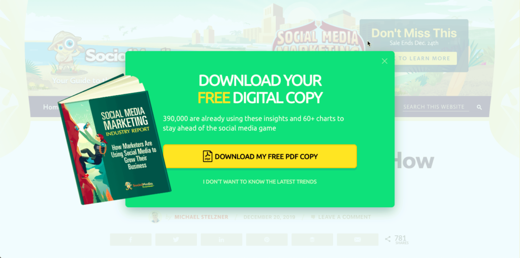
Why did THIS popover work for me?
Given that I just wrote about how annoying it is to get email signup popovers earlier that day, it struck me as odd that this one “worked” for me. When I saw this, I somehow wanted it, and did not feel annoyed by it in the same way. Now, I’m sure this is personal, but…
Read ItI can’t read the ant text of your email on my iPhone.
So much we are crafting our careful email on our full-size computer; we are then reviewing our careful email on the full-size computer; and 75% of our readers are looking at them on a smartphone. Here is the problem: and… I have tried to make the dimensions here comparable to what I see on my…
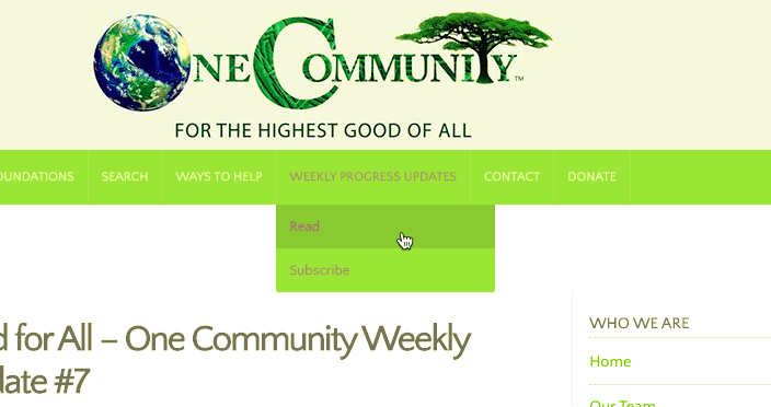
Read ItAnother good example of clear offer in email
This one is very simple, and you’ll see that the type is small and hard to read, but the point is that they are highlighting a promise of what you will get. And: In fact, notice that they are not highlighting the format, they are highlighting the outcome. “Weekly progress updates” is what you get…
Read ItNot being shy about your newsletter
I like the way Tim Ferris puts his newsletter as a menu item on his website. This is part of an integrated strategy—I like what he says about the newsletter too: Every Friday, I send out an exclusive email with the five coolest things I’ve found (or explored) that week. It could include exclusive giveaways…
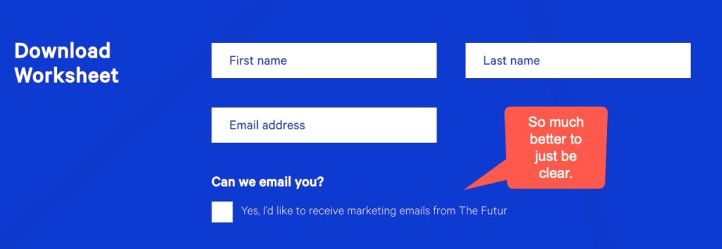
Read ItA bold and honest ask
What I love about this is that the design itself says, “we are not afraid to ask first before we send you emails.” People actually get to decide. This was literally on their lead magnet page! Now, this is on the website for a design company, and so the design elements are very well executed,…
Read It


